Thumbnail Sketches
Thumbnail sketches are the compositional workhorses of the drawing world. The composition is the overall layout of a work of art. So a thumbnail sketch is like a blueprint to figure out where the elements of the finished drawing / painting / etc. will be. Rarely (maybe never in the history of ever) are thumbnail sketches considered finished works, but they can be a very helpful way for an artist to visualize many different layouts very quickly. Most thumbnail sketches have no (or few) actual details, and take at most 30 seconds to create. But they are a remarkably good way to look at a composition and immediately know if it will work – or not.
The way I was always taught to create a thumbnail sketch – the way I still do today (and I do many before any large finished work; my sketchbooks are riddled with them), is to loosely draw a small box of the approximate aspect ratio (square? tall rectangle? wide rectangle?) on the paper. Then I quickly (with a few marks at most) set in the major elements of the work – no time for details here. Just things like the horizon line, major trees / foliage, roads (in a landscape), general pose and primary surroundings (in a portrait). That lets me immediately see if the overall arrangement I have in mind is pleasing, or needs to be shifted.
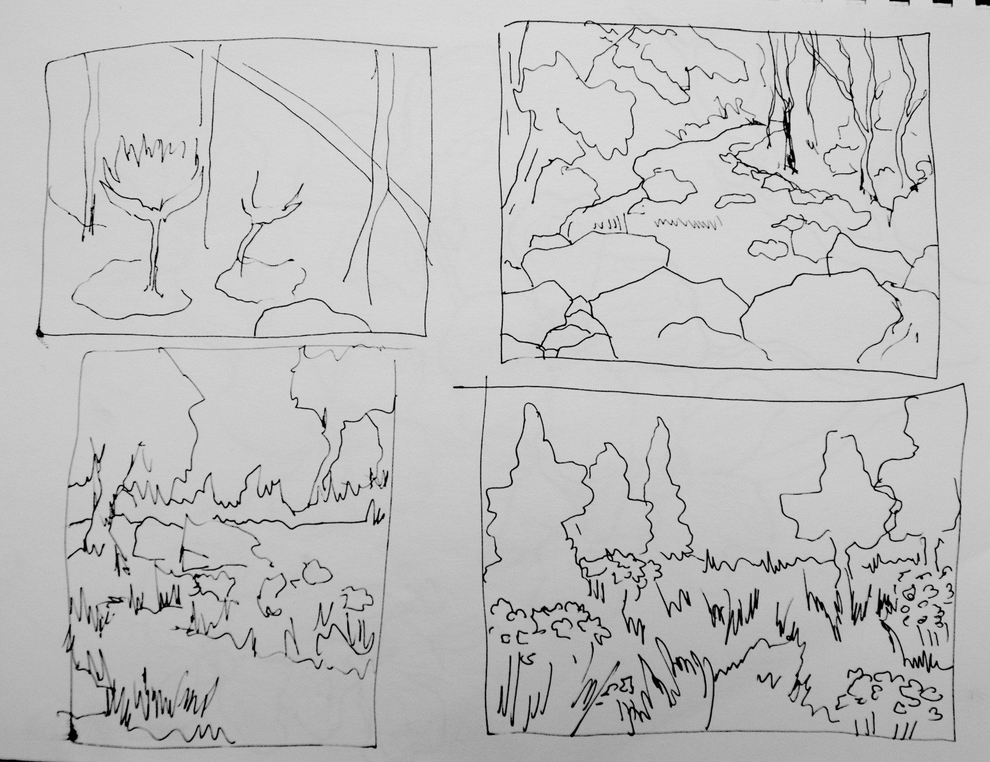
This picture is a set of three thumbnail sketches I drew to work out a composition focused on a road. In these sketches, I was attempting to determine the most pleasing eye-level, and the position of the road on the canvas (should it be traveling into the distance, or disappearing around a visual obstruction?).
The reason thumbnail sketches work so well is that, when we create art, we can become so fixated on small details that we lose the big picture. It’s like, if you’re building a house, and you’re very worried about the couch you choose and the granite on the countertops, and you forget to look at the overall layout of the house, and see if it meets your needs as a whole. First the house has to have a pleasing and functional overall design, then you pick the furniture. Drawing is the same way – big picture first, then details.
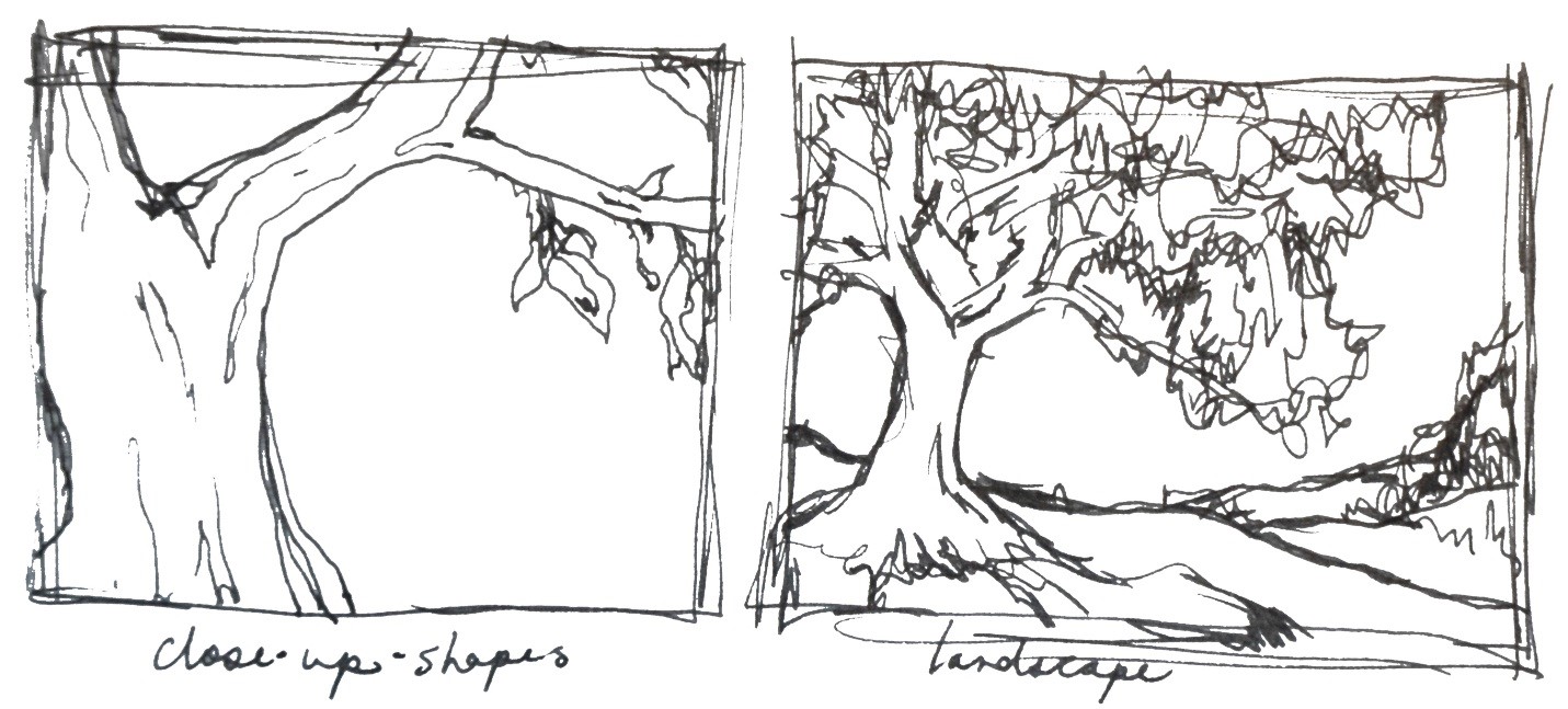
These two thumbnail sketches examine several possible ways to draw a large, beautiful tree – one is more of a stereotypical landscape composition, and one is more abstract, with the tree breaking up the space of the canvas. There are no ‘right’ or ‘wrong’ choices for an artist working out a composition, by the way. The purpose is to guide personal vision, and to have a design in mind. Any of the thumbnail sketches I created might have worked well for my finished works, depending on what my goals were.
So look at the different thumbnail sketches I’ve included. Can you quickly scan the images, just to ask yourself: “what do I (as the artist) find most pleasing as an arrangement?” Don’t worry about what that blob in the front is, or “is that a tree or a mountain” … none of the details matter at this point. What matters is, which one has an arrangement that feels ‘right,’ to you?
Your answer will be different from mine – this is art, and it is subjective in many ways. Just as you might like a Tudor-style house, and I’m all about mid-century modern. Personal tastes differ, but each artist should have a plan going in to any finished work of art. (Plans can change, but it’s generally better for the artwork if the change is a choice rather than a haphazard event.) Thumbnail sketches let each artist decide for him- or herself, quickly and efficiently, “this is the plan for me!”


